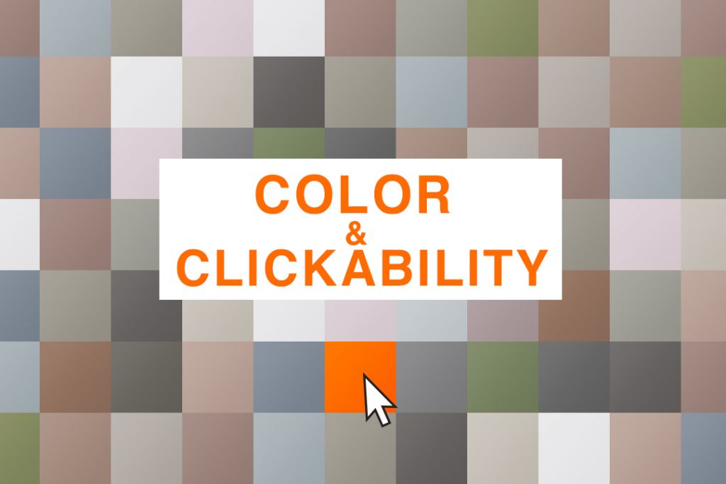
Color and Clickability – design for digital communications
In the age of digital media our brains process hundreds of images through a screen each day. So, what is the secret to standing out enough to get the viewer to click on your product. The answer is through the use of color. Think about it, you’re scrolling through your Instagram feed and what do you see? Selfies, vacations photos, dogs, cats, memes, more dogs, then BOOM! a bright pop of the color red catches your eye and causes you to stop your scrolling. The use of color can cause the viewer to slow down a few seconds to see your product and decide whether they want to click.
The following image (blurred to protect privacy and enhance focus on color only) shows one of our client’s recent post and its surrounding posts in one of our team member’s Instagram feed. As you can see the large area of red stands out against the rest of the photos.

The use of bright colors has been a trend that has taken off recently. This is due in part to another trend that has taken place in web design. Web pages have taken on a minimalist approach in recent years which has resulted in cleaner layouts and neutral color backgrounds, usually white or light gray. This design shift has been critical because these lighter backgrounds allow for the bright colors to stand out even more. This cleaner approach has been adopted by social media apps, newsletters, etc. This is great because it ensures that your design will work across many platforms.
The image below demonstrates how the lighter backgrounds make large blocks of color pop. In sample A, the image seems brighter and the background doesn’t distract the viewer. Samples B and C show background colors that work well with the composition of the post but compete for the viewer’s attention therefore causing the image to blend in.
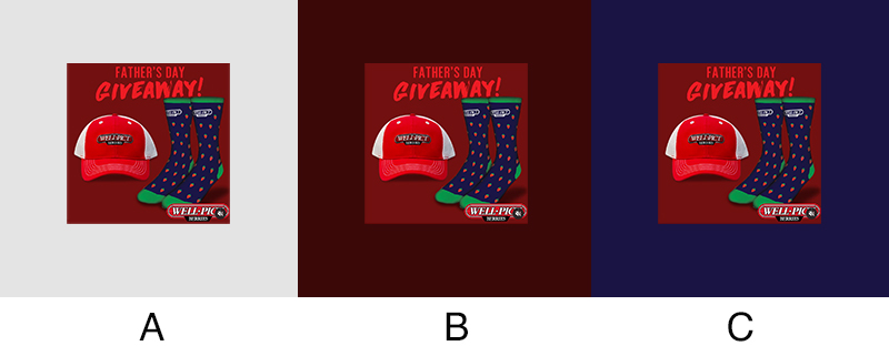 The sample image above resulted in one of the most successful giveaways for our client in terms of engagement. This was due in part to our use of our client’s brand colors in a way that would stand out and causing followers to stop, learn about the giveaway and engage with our client.
We have created several campaigns using this approach resulting in very happy clients. As a graphic designer that enjoys working with color, these have been campaigns that I have greatly enjoyed. Reach out to the Marketing plus team for your next campaign and we’ll be happy to add some color to your campaign.
By: Oscar Burgos
Graphic Designer